
Redesigning a travel app around the customer journey
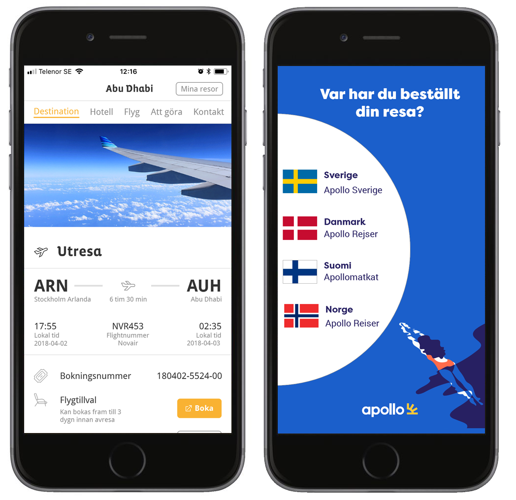
Apollo is a Nordic tour operator offering packaged holidays. I redesigned its established mobile app around the customer journey, bringing booking management, flights, hotels, destination content and additional services into a more coherent experience before and during travel.

- Travel
- Consumer Products
- Mobile Apps
- Customer Journeys
Summary
I redesigned Apollo’s travel app as it moved to a new technical platform, using product data, customer feedback, competitor research and usability testing to identify where the existing experience needed improvement. The work covered the journey before and during travel, from managing different trip types to flights, hotels, destination information and services.
I translated the findings into new interaction flows and a practical mobile UI, validated the solutions through usability testing and supported implementation. The redesign clarified important travel flows, resolved specific points of confusion and introduced Apollo’s new visual profile across the app, while creating a more coherent transition between native and web-based services. Detailed specifications also gave development and QA a stronger foundation for building the new app.
Role
Dec 2017 – Apr 2018
UX Designer
Scope
User research & analytics · Requirements · Interaction design · User testing · Implementation specification · Design systems · UI design
Platform
iOS · Android · Xamarin · Integrated web services
Team
Product Owner, UX/UI Designer, six developers and QA, with input from internal stakeholders and commercial teams
The Challenge
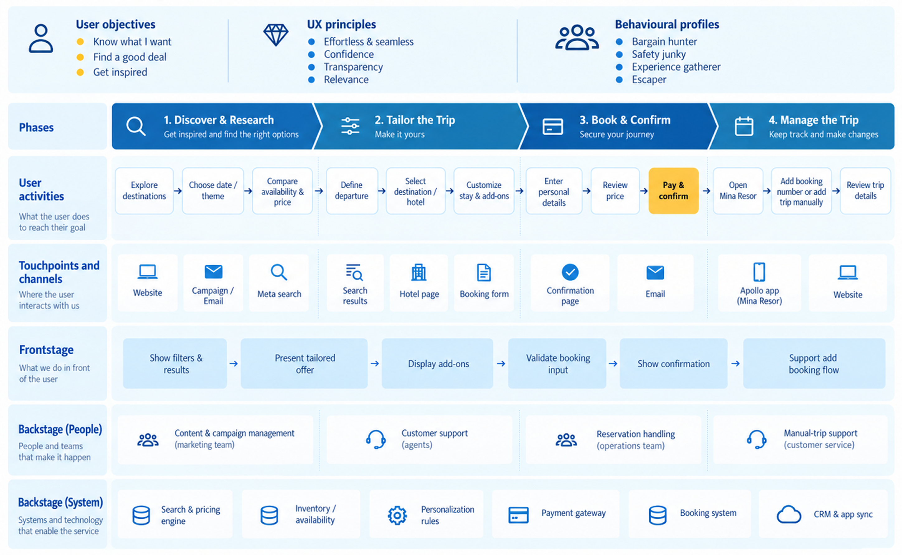
Apollo was rebuilding an established travel app on a new technical platform while also aiming to create a simpler and more cohesive experience. The challenge was to improve the product without losing the functionality and information that existing customers relied on.
Supporting a broad customer journey
The app was used both before and during travel and covered a wide range of needs: managing bookings, checking flights and hotels, finding destination information, discovering activities and accessing additional services.
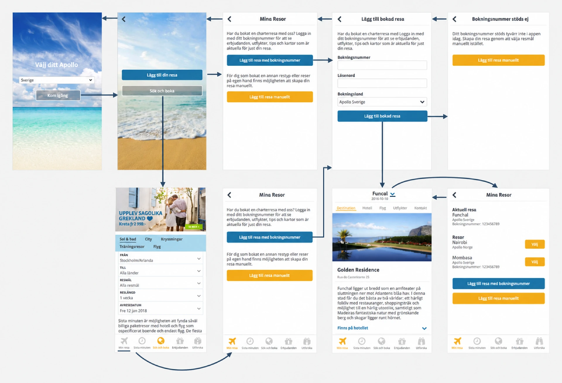
It also had to support different kinds of travel. The product had grown from a destination-focused charter app to include booked trips, dynamically packaged travel and manually added destinations, creating different information and service needs depending on the type of trip.
The challenge was to bring these needs together into a coherent experience across the customer journey.
Improving an established product
The redesign could not start from a blank slate. The app already had substantial usage and an established set of features that customers depended on.
At the same time, the existing structure had evolved over several years and included different ways of handling bookings, destination content and additional services.
The redesign needed to improve these areas without disrupting the parts of the experience that already worked well.
Creating a coherent experience
The app depended on several surrounding web and booking services. Some activities could happen natively, while others had to open framed web content or external systems.
The move to a new technical platform created an opportunity to reconsider these patterns. Xamarin provided a shared codebase across iOS and Android, but the design still needed to accommodate platform-specific interaction patterns and technical limitations.
The challenge was to define flows that felt consistent and complete while remaining realistic within the constraints of the new implementation.
My Role
I worked hands-on across the design process, from research and analysis through interaction and UI design, prototyping, usability testing and implementation specifications. I worked closely with the team using research and testing to progressively refine the experience and resolve design questions before implementation. My responsibility extended from identifying problems and defining flows to specifying detailed states, errors, transitions and platform behaviour for development.
Using evidence to identify where the experience needed attention
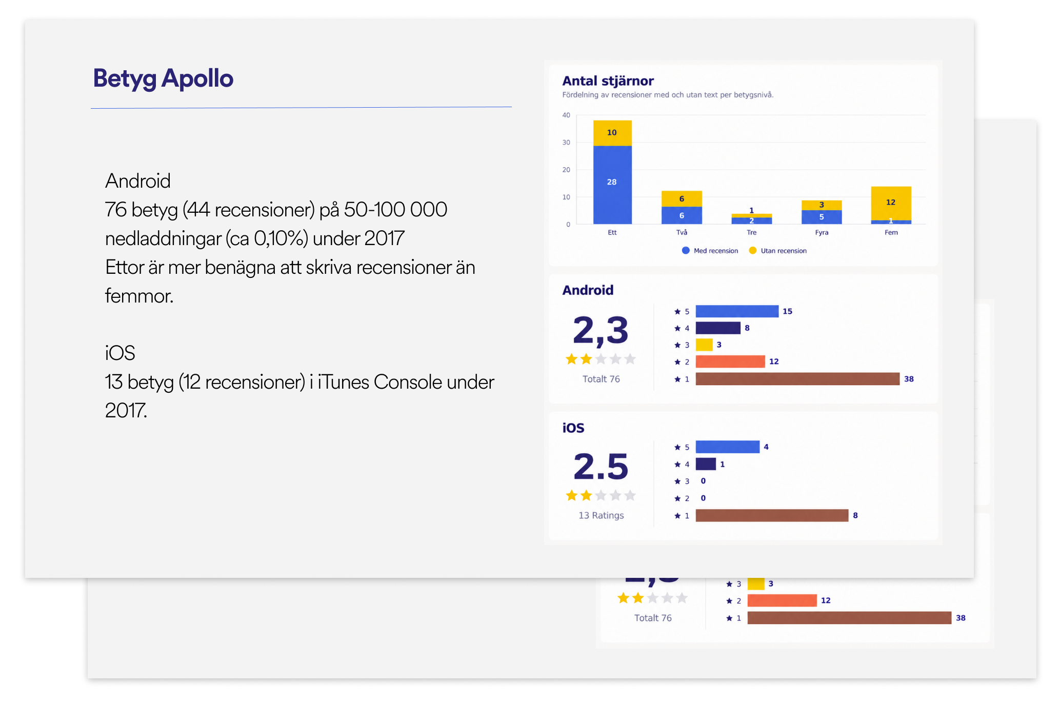
I combined several sources to understand where the existing experience needed attention: app ratings and reviews, usage and error data, competitor analysis, existing business goals and input support and sales teams.
For example, the data showed that manually adding destinations was used much more than expected and that booking retrieval generated a high proportion of errors. This helped challenge assumptions about how the app was actually being used and where design effort was needed. Customer reviews also pointed to problems beyond technical stability: missing information, fragmented web experiences and situations where users had to leave the app or call to complete a task.
My competitor analysis focused on the parts of the journey that appeared fragmented or unclear. Rather than copying competitors, I used the comparison to identify different approaches and clarify where Apollo’s experience could be improved.
Designing and testing the key journeys
I planned and conducted scenario-based usability tests using realistic travel tasks and interactive prototypes. I prepared and moderated the sessions, analysed the findings and prioritised changes for subsequent design iterations.
The first round exposed issues in key areas such as My Trips, manually adding a booking, terminology and navigation, as well as inconsistencies between app and web content. These findings were translated into concrete design changes and tested again in a second round.
The follow-up showed that the revised flows were clearer and more intuitive, including the step-by-step process for adding trips and the treatment of web-based content within the app. Remaining issues were carried into further iteration.
Taking the design into implementation
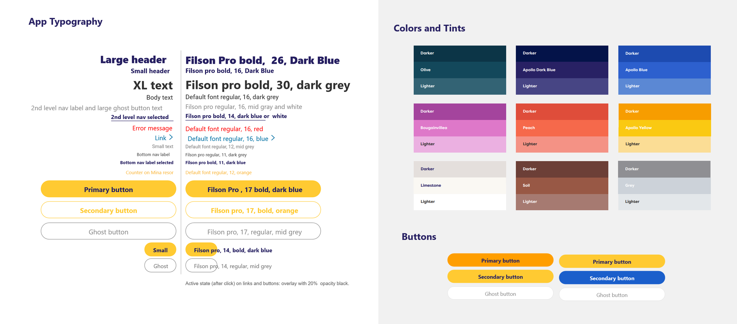
Alongside the interaction work, I translated Apollo’s new visual identity into a practical mobile UI and assessed where the brand guidelines did not work well in an app context.
For example, I identified contrast problems with proposed brand colours and body text, recommended alternatives in line with WCAG guidelines, considered the limitations of custom typography in Xamarin, and defined reusable button, navigation and icon patterns.
I documented the final behaviour for forms, validation, navigation, iconography, loading, transitions and other components, working closely with development and QA to resolve interaction questions before implementation.
Impact
The work resulted in a more clearly structured and validated experience for several central parts of the travel journey, together with detailed designs ready for implementation on Apollo’s new technical platform. Key flows were refined across multiple iterations, giving the team greater confidence in both the user experience and the implementation direction.
Stronger product decisions and implementation
The redesign combined qualitative feedback, product data, competitor research and usability testing rather than relying on a single source of evidence.
Together, these inputs gave the team a stronger basis for prioritising changes around observed behaviour, recurring user problems and commercial goals. Close collaboration with development and QA also meant that interaction questions, accessibility considerations and platform constraints were explored before implementation. The final specifications translated Apollo’s new visual identity into reusable mobile patterns, creating a clearer and more consistent foundation for building and extending the app.
Improving business-critical travel flows
Usability testing exposed concrete problems in important parts of the experience, including navigation in My Trips and the process for manually adding a booking.
Redesigning and retesting these flows led to clearer interactions and better understanding of key concepts. The step-by-step process for adding trips was easier to follow, while earlier confusion around vouchers and booking was resolved. These improvements also supported wider product goals such as customer satisfaction, efficiency and opportunities for ancillary sales.
Remaining issues were prioritised for further iteration, giving the team a clearer view of what had improved and where additional refinement was still needed.
Creating a more coherent journey
A recurring design challenge was the boundary between the native app and surrounding web services. Because not every service could be rebuilt as native functionality, the experience needed to feel coherent despite the underlying technical boundaries.
The revised treatment created a more consistent transition between native and web-based content while allowing existing services to remain in place. In the second round of testing, participants accepted the framed-web experience without reacting negatively to the transition. This showed that greater continuity could be achieved through interaction and visual design, without requiring every part of the travel journey to be rebuilt as native functionality.